Honeybee health
Operations software for an online pharmacy
Timeline
December 2023 - April 2024
My Roles
UX Researcher and Designer
Skills Used
User research, wireframing, prototyping, Figma
Problem
The company was losing time and $$$ from order exceptions which was preventing their ability to scale.
Context
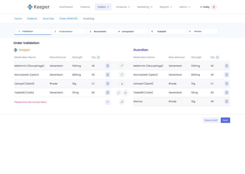
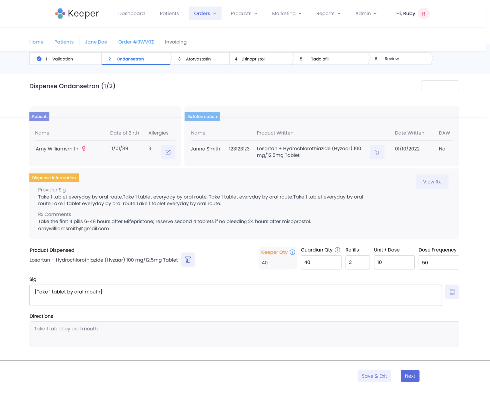
This internal software system was created 4+ years ago. At first glance, you can see there is A LOT of information on these screens.
Original screens below
We found in the current process, the operations team members spent these averages to completely process and ship an order.
Wait, WHAT are order exceptions??!
Internally, we used the term “order exceptions” for anything that did not follow the happy path.
order exceptions = any obstacle that thwarts the happy path
In the current system, we have a dropdown menu of reasons for the hold status that include these other order exceptions. However, a large percentage of these order exceptions are undocumented because it does not change the status of the order to be “On hold.” Instead, the operations team can manually edit things to finish processing the order.
why solve?
The order exceptions waste a lot of time troubleshooting. Also, the company sometimes would pay for expedited shipping at their cost in order to meet the required Service Level Agreements.
With the current bottlenecks from order exceptions, it was preventing their ability to scale.
Without the ability to scale, the company can’t grow. And to a startup, it could mean a huge loss of potential business.
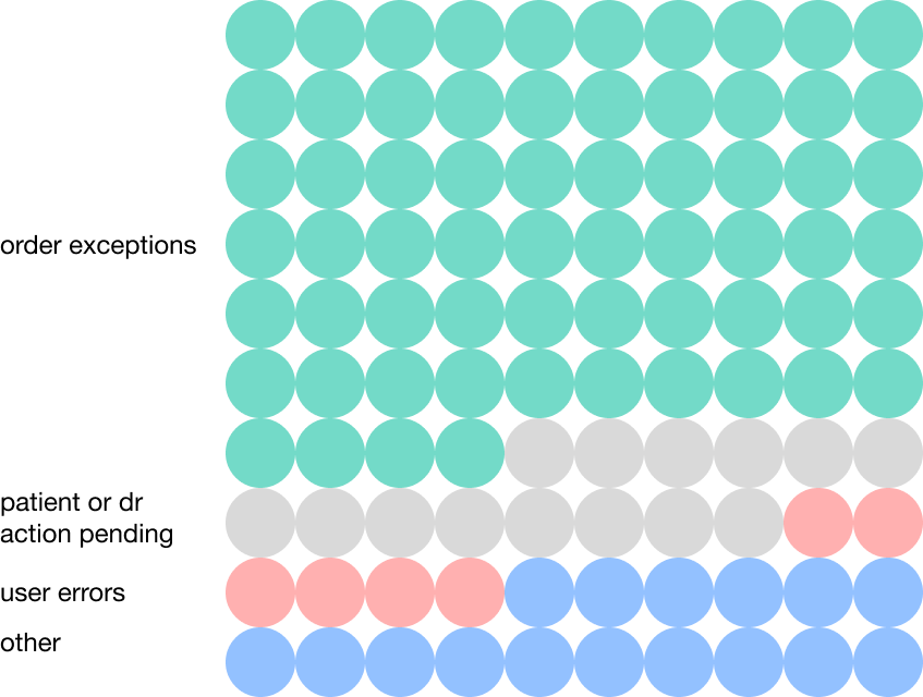
problem breakdown
74%
of incomplete orders are because of undocumented order exceptions
Research
To understand why these problems of order exceptions occur, I listed questions and research goals. Then, I narrowed them down and distilled them into categories.
User interviews
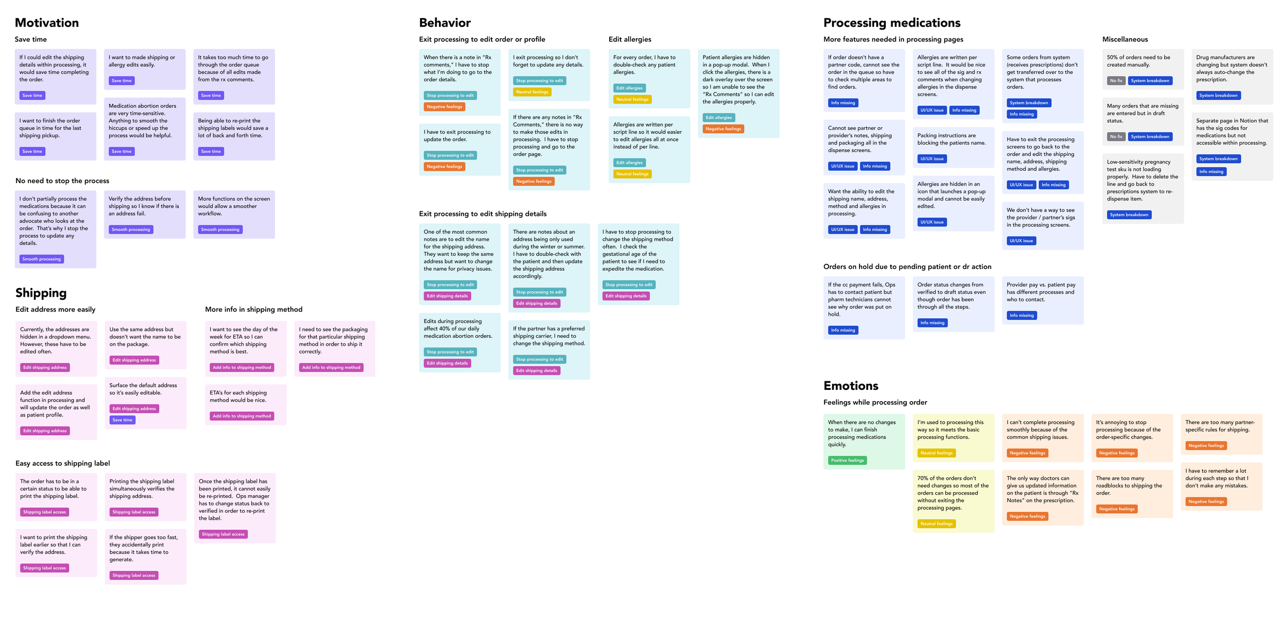
I shadowed 4 operation team members that went through the 16 processing steps and interviewed them. After seeing the many hiccups during the process, it was a little overwhelming to make sense of it all. I used card sorting to analyze and discover any themes.
card sorting
After looking at the card sorting, we decided to focus on processing and shipping first as they would affect most of the undocumented order exceptions.
constraints
Guardian is here to stay 😣
(Unfortunately, for the forseeable future)
Minimize changes to Keeper 😕
(Currently on Bootstrap - transitioning to Tailwind CSS)
User story
Root of the problem 1
2 software systems working together
The operations team had to make so many manual edits because 2 software systems take care of different parts of the process. The pharmacists and operations team needs to look at the 2 systems to reconcile the prescription so that the medications are processed correctly.
Checking between the 2 software systems:
Pharmacists = reconcile strength and quantity of the medications
Operations team = reconciles the patient profile details and inventory to fulfill the orde
Root of the problem 2
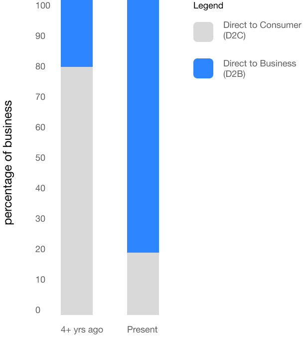
software DESIGNED for the old business model
Design
Constraints review
Guardian is here to stay (unfortunately)
Change very little in the original design since this is a temporary fix before moving to Tailwind CSS
Happy path = no scroll
Device screen
Desktop - extra wide monitor about 30% wider than traditional desktops.
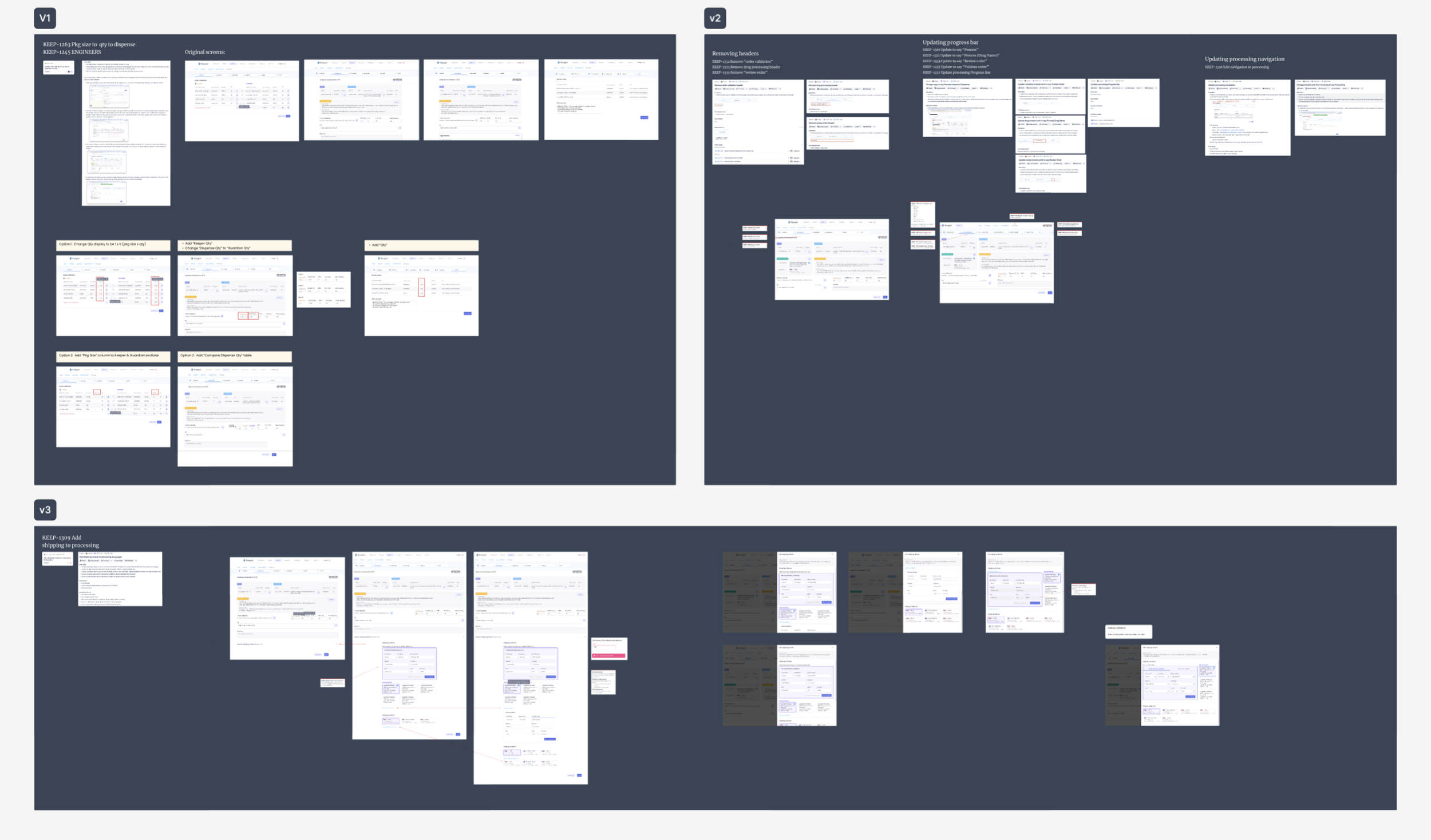
initial drafts
solution
highlights
Original header
Close-up of added section
New header
New designs after moving to Tailwind CSS
We concurrently also worked on a version that was fully redesigned for Tailwind CSS.
“Rx Comments” section
Before: The doctor sends any address updates through the prescription under “Rx Comments.”
The user had to look at the processing page under “Rx Comments” to make the address update in the order shipping tab page. They toggled between the two pages to make sure the information was updated correctly.
After: “Rx Comments” section added at the top of the “Edit Shipping Details” page
Header changes
The original header was taking too much room and was very cluttered. We did an audit of what is currently in the header and made the below changes.
Removing unneeded clutter the Operations team did not use/need
removed logo
removed main menu items
removed breadcrumb
Changes to the header
Order # is largest to denote hierarchy
partner name in grey close to order # to show it is associated with the order
back to orders to go to the queue of pending orders to process if there is a block on this order
exit processing by click on the order #
Progress bar
now on the same line as the header to reduce vertical space
colors added to enhance visibility of progress states
descriptions added to denote what step of progress
tap area on bar is extra large for users to click easily if they need to go back to a certain step
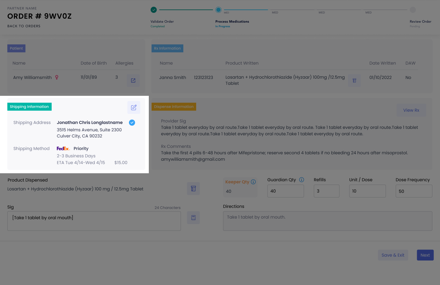
“Shipping Information” section added
Originally, the user had to exit processing in order to make any changes to the address.
Revised screen has a “Shipping Information” section added
If there are any edits, a pop-up modal would appear
pop-up utilized to fit within the constraint of no scrolling
Original screens
New screen
“Shipping Address” section
Before, the address options were hidden in a dropdown menu. After selecting the address to edit, the user would have to click on a 3 dot icon to edit the address.
To remove 2 clicks, I had the default selected address to also have an “edit selected address” area with the form fields already surfaced.
The check icon represents that this address has a ship history. That means that we have successfully shipped to this address before.
The copy address icon was added to speed up any order consolidations
“Shipping Method” section
Radio button to button
The old system had a radio button with a very small tap area. It looked antiquated and was not easy for the user to click. I got rid of the radio button so that there was more room for the information needed and a larger tap area for the user.
ETA change
Before, the ETA was near the shipping cost module, separate from the shipping method module. However, the user had to select the shipping method for it to show the ETA. I added the ETA’s for each shipping method so the user can make an informed decision about which shipping method to choose instead of clicking through each shipping method.
I also added the day of the week for the user’s convenience so they don’t have to look at a calendar before deciding a shipping method.
Conclusions + Lessons Learned
Did we improve the efficiency of processing orders?
impact
Before redesign
Yes, We increased our efficiency by 25%.
We looked at our KPI’s to measure our success and found that this resulted in an average of 7 less clicks and reduced the process time by 2 minutes. Operations was able to process 2,000+ more orders a day because of these changes.
Reducing cognitive load
=
Averages of Operations team to completely process and ship an order
After redesign
lessons learned
powerful
=
Reducing cognitive load is powerful. Once we had the “RX Comments” in the place where you make edits, it effectively cut down on the processing and editing time.
More ideas
I had to ask so many questions during this process so I had a few extra meetings with the operations team. They were a little annoyed but I had to push past my people-pleasing tendencies in order to effectively prioritize the issues and balance the user wants and needs. The extra meetings definitely helped produce more ideas like condensing the header for the processing steps.
NExt steps
I started designing a redesign in anticipation for the new migration to Tailwind CSS. The new designs are focusing on streamlining the many different partner requirements so we can have less diverging user flows. However, with trying to onboard several new large partners, they wanted to hold off on this project for now.


